My thoughts:
I think.. face too dark, highlights too blown, composition is a bit unusual? I like the perspective though. Colours/clarity are a bit off though I'm assuming you were shooting through a window.
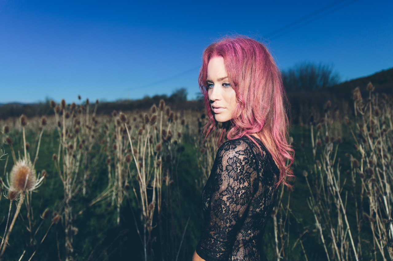
Not a huge fan. colours are kinda cool. powerline is annoying, composition a bit odd and i kinda just dont get 'it'
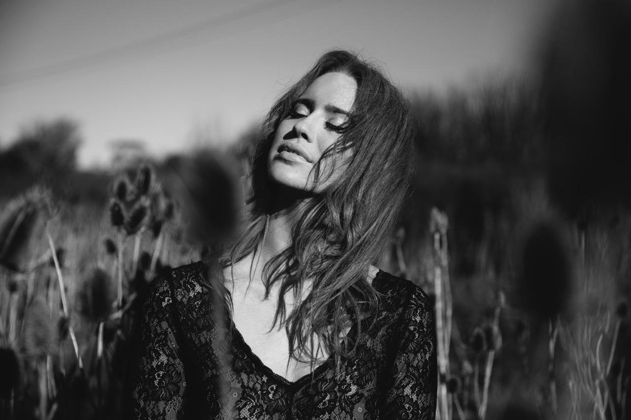
This one, I think, is stronger. Again, powerlines (though you already mentioned it, you could have just shot another direction? ha). composition feels a bit boring to me too.
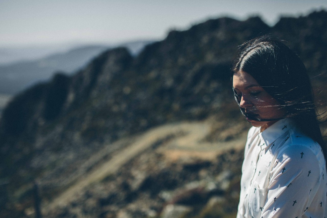
I love everything about this apart from the hair over her face.

"VSCO" by Andrew Kevin Benson, on Flickr
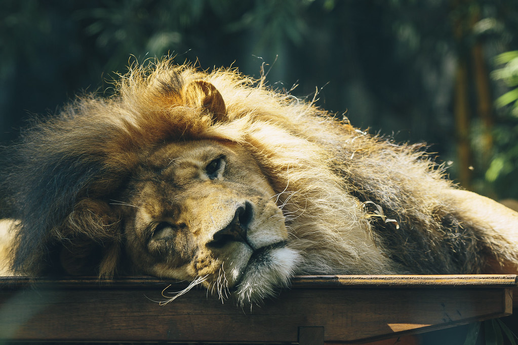
Cool subject and location, but not sure all the white sky really works for BW. Also what is he even doing?
I think.. face too dark, highlights too blown, composition is a bit unusual? I like the perspective though. Colours/clarity are a bit off though I'm assuming you were shooting through a window.
Not a huge fan. colours are kinda cool. powerline is annoying, composition a bit odd and i kinda just dont get 'it'
This one, I think, is stronger. Again, powerlines (though you already mentioned it, you could have just shot another direction? ha). composition feels a bit boring to me too.
I love everything about this apart from the hair over her face.
"VSCO" by Andrew Kevin Benson, on Flickr
Cool subject and location, but not sure all the white sky really works for BW. Also what is he even doing?

