Nick53
Likes Bikes and Dirt
Hey guys,
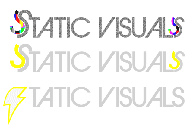
I'm working with Ray from Adelaide on a new logo/website for my media brand, Static Visuals. It would be great if you could vote on which you like best by voting in the poll either top, middle or bottom. Post a comment if you have an idea or further opinion on it.
Thanks
I'm working with Ray from Adelaide on a new logo/website for my media brand, Static Visuals. It would be great if you could vote on which you like best by voting in the poll either top, middle or bottom. Post a comment if you have an idea or further opinion on it.
Thanks
")
