Norco 2010 Launch

i dont mind a few of the colours, but some of them are just horrid!

i think they should go back to their colours of 2005/2006, nice and plain, with a bit of decal work.
 
I dont mind this one.

pbpic3720654.jpg
 
Well i guess they have up'ed the specs and lowered the budget for the aesthetics department.

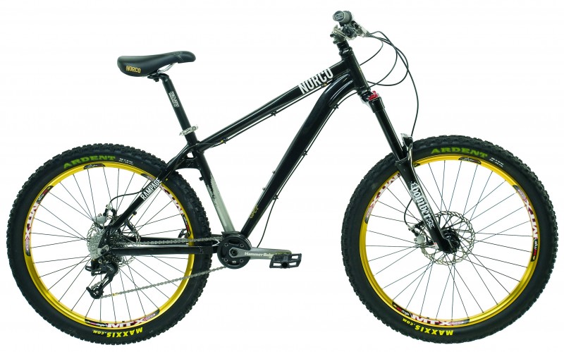
The Dj bikes don't look to bad though, better the last years colour schemes.
 
They get uglier each year...

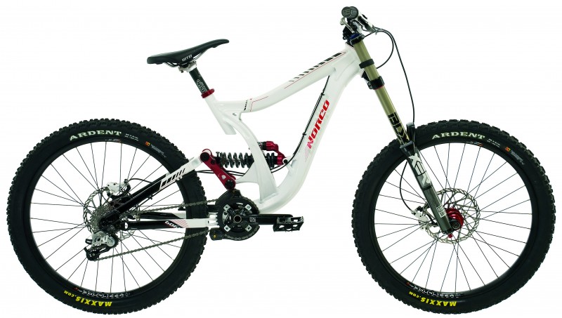
If the 09 Team DH was as good as they advertised it to be, why change?
Why what have they changed? The frame appears to be the same.
My questions is how long it will before they find something else wrong with their frames? ;) Will we even make it to 2010?
 
I would love to test ride a Team Dh. They look more stable than the previous models especially the higher BB types on the 08 model!
 
Seeing the new Atomik makes me like my 08 even more! especially since i have a new frame for it. Anyway i thought this was the pick of the bunch...nice,
 

Attachments

  • new norco 2010.jpg
    new norco 2010.jpg
    90.9 KB · Views: 154
Add me to the "The 2010 Norco's look like shit" group. That DH Team is just plain nasty, too much hydroforming, butting, gussets, twists and turns.

The Ryde and Atomik look *decent*, but still not very appealing to me.
 
Last edited:
is it me or do they look unbalanced? hard to describe but where the seat is just looks plain wrong. I loved the 08 and 09 range but this just looks tacky.
 
My initial thought was ugly.....Then I looked at it for a while and a quite like the Team DH, but I hate the colour of the atomik......

The white seatpost is a nice touch, tho
 
i think norco should seriously rethink their choices of colour and curvuture with the dh bikes but the freeride hardtails and dj bikes look quite nice i thought. 250 paintjob is completely trippin though:)
 
I don't like being a nay-sayer but christ the Team DH is ugly!

IMO they're getting uglier year to year! I'm sure they ride well though, just don't look down when riding.
 
Back
Top