New Club T Shirt Design (more Designs)

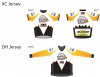
Excellent design - people will join the club just to get to wear the T shirt. Think Ryan should wear the official vest to meetings instead of a tie!
MM
 
Not having much luck with Ergon so perhaps we push ahead with the two sponsors unless anyone else has any other suggestions.

Cheers
 
Sounds good to me ... we get too many colours on there and we start to look like bloody lorikeets anyway!!
 
Good Fundraising!

Hopefully the third sponsor comes on board, will turn these Jerseys into a good fund raiser, and make them look like a rainbow...
 
Dennis from Toowoomba Steering and Suspension has also been kind enough to also put up sponsorship for the Jersey. Conga can you PM me your email address or if anyone else knows its so I can send you his logo.

Cheers
Ryan
 
Here are the new sponsor logos added.
 

Attachments

  • CycleJersey_Concept_02.jpg
    CycleJersey_Concept_02.jpg
    106.6 KB · Views: 140
Wow Conga I think that you have really nailed it the way you have put these logos etc together ... well done!!

Ben has had a look and assured me that Mobil/ECL are happy with the placement and presentation of their badges as is.

2 weeks till the next meeting - would be hopeful that the design gets the nod there.

All constructive comments in the meantime welcome.
 
523501_258283410930084_181150628643363_550687_432809919_n.jpg


I dont know if its the intention, but the TMBC jersey & TCC jersey are remarkably simialar in color scheme, particulary the yellow fade to white. not stirring just poniting it out.
 
I dont know if its the intention, but the TMBC jersey & TCC jersey are remarkably simialar in color scheme, particulary the yellow fade to white. not stirring just poniting it out.

Hey Aaron ... might just be my non-artistic eye, but I'm not seeing much of a similarity ...
 
No intention to copy the TCC jersey. I do think are very different in design and colours. TMBC is mainly Black and yellow where as TCC is mainly Blue with a hint of yellow. Let me know if this is going to conflict.
 
Apart from a bit of yellow & the word "Toowoomba", they are not like each other at all. Ours definately looks better :)
 
Last edited:
As mentioned not out to stir the pot, just pointing out the similarities. Either way good design guys.
 
Back
Top